
Effective Strategies for Data Visualization
How to design charts and reports that people understand and act on: clarify the message, pick honest encodings, use color and labels for cognition (and accessibility), avoid common chart lies, and test with real readers—aligned with SEO and answer-engine friendly structure.
On this page
DataNests
Turn data into dashboards your team actually uses
Connect sources, build client-ready reports, and ask questions in plain language with AI assistance.
Visualization is a sentence, not a decoration
A chart should complete a thought: “Revenue grew after the pricing change” or “Support backlog is concentrated in two categories.” If your visual cannot be summarized in one short sentence, the audience will invent their own story—often the wrong one. Lead with the claim, then support it with the graphic.
Define the job before the geometry
Ask: comparison, composition, distribution, trend, or relationship? Each job maps to a small set of effective forms. Mixing jobs on one chart (for example trend plus detailed composition) usually needs small multiples or separate panels instead of one busy graphic.
Reduce ink, keep meaning
Remove chartjunk: heavy borders, 3D effects, gratuitous gradients, and gridlines that do not aid reading. Gridlines parallel to quantitative axes can help; everything else competes with the data. Default to the simplest mark that carries the information.
Color is for meaning, not decoration
Limit categorical palettes to a handful of hues. Use one highlight color for “this is the point.” For sequential data, use a perceptually uniform scale. Check contrast for text on fills. About one in twelve men has some form of color-vision deficiency—never rely on red vs green alone to encode critical status.
- Reserve saturated color for exceptions or the main series.
- Use texture or shape in addition to hue when status is safety- or compliance-critical.
- Legend placement should follow reading order; direct labeling beats distant legends when feasible.
Titles and annotations do the heavy lifting
A descriptive title (“North region missed plan by 8% in Q3”) beats a generic one (“Revenue by region”). Annotations should answer obvious questions: what happened, when, and compared to what baseline. For public or client-facing work, define units and currency once per view.
Avoid common “honesty” traps
Truncated axes, inconsistent scales across small multiples, cherry-picked date ranges, and cumulative curves without clear baselines all distort perception even when the numbers are “true.” If you need a non-zero axis for a narrow range, show context or inset a zero-baseline view. Your credibility is part of the deliverable.
Accessibility is part of clarity
Provide alt text or a short data summary for key visuals in written reports. Ensure interactive charts are keyboard-usable where you control the stack. For static exports, include a table appendix for users who cannot parse the graphic.
Test with someone outside the project
Five minutes with a colleague who was not in the analysis will surface confusing legends, ambiguous filters, and jargon. Ask them to speak aloud what they think the chart says. Mismatch between intent and interpretation is the signal to simplify.
Visualization inside DataNests and similar tools
Modern analytics products let you iterate quickly—use that speed for feedback, not for adding every possible series. Build the smallest chart set that supports the agreed decision, then layer optional detail behind filters or secondary pages. Pair visuals with plain-language explanations where you use AI assistance, and always verify figures that affect money or policy.
Takeaways
Clarify the sentence first, choose the geometry second, cut noise third, and verify with a fresh reader. Those four steps outperform any default color theme or trendy chart type.
Questions people ask when they start
Straight answers—no sales fluff. If you are comparing tools or onboarding a team, these are the details that usually come up.
What is the first step in designing a data visualization?
State the message in one sentence: what you want the reader to conclude. Then choose a chart type that encodes that comparison, trend, or distribution clearly.
How do I choose between a bar chart and a line chart?
Use lines for continuous change over time. Use bars for comparing discrete categories or ranked values. Avoid lines for unrelated categories.
Why does color choice matter in data visualization?
Color carries meaning and hierarchy. Overuse reduces salience; poor contrast excludes readers. Do not rely on red vs green alone for status—add labels or patterns for accessibility.
What is chartjunk?
Decorative elements that do not encode data—heavy 3D, excessive gradients, redundant frames. Removing chartjunk improves accuracy and reading speed.
How can I make charts accessible?
Use sufficient contrast, direct labels, text summaries or tables for critical insights, and avoid color-only encoding. For interactive charts, support keyboard navigation where you control the implementation.
What is a common honesty mistake in charts?
Truncated axes without context, inconsistent scales across panels, and cherry-picked date ranges. Always ask whether a reasonable reader could misread the intent even if the numbers are technically correct.
Keep reading
Related posts
More on dashboards, integrations, and how teams ship client-ready analytics with DataNests.

November 15, 2025 · 18 min read
Getting Started with DataNests: A Complete Guide
A practical, in-depth guide to DataNests: who it is for, how to connect real data sources, build your first dashboard, use the AI assistant with example prompts, share with clients, and avoid common mistakes. Includes FAQs for search and AI assistants.
Read article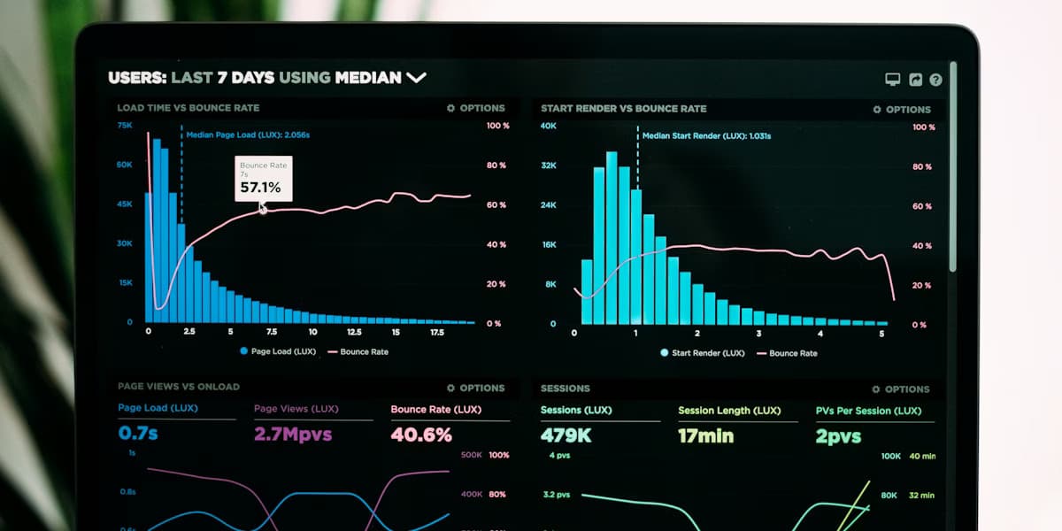
November 12, 2025 · 14 min read
How to Build Effective Data Dashboards
Practical dashboard design for teams and clients: define decisions first, match layouts to executives vs analysts, pick charts that tell the truth, handle filters and performance, and ship dashboards people reopen—plus how tools like DataNests fit in.
Read article
November 5, 2025 · 15 min read
Choosing the Right Data Integration Tools
A practical framework for picking data integration and analytics tooling: inventory sources and latency needs, compare ETL vs ELT vs streaming, evaluate connectors and total cost, run a focused proof of concept, and connect integration choices to how teams consume data in dashboards.
Read article