How to Build Effective Data Dashboards
Practical dashboard design for teams and clients: define decisions first, match layouts to executives vs analysts, pick charts that tell the truth, handle filters and performance, and ship dashboards people reopen—plus how tools like DataNests fit in.
On this page
DataNests
Turn data into dashboards your team actually uses
Connect sources, build client-ready reports, and ask questions in plain language with AI assistance.
Why most dashboards end up ignored
A dashboard nobody opens is just expensive wallpaper. Usually the gap is not missing charts—it is missing a shared understanding of what decision the screen is supposed to support. Before you pick a single widget, write one sentence: “When someone opens this, they should be able to decide ___.” If you cannot finish that sentence, pause.
Start with the decision, not the chart
Good dashboards answer a small set of questions repeatedly: Are we on track? What changed? Where should we look next? Tie every block on the page to one of those jobs. If a metric does not change what someone does this week, it is a candidate for a deeper report—not the main view.
Know who is in the room
Executives want a tight story: a few KPIs, clear period labels, and obvious good-or-bad context. Analysts want dimensions, filters, and paths to drill without exporting to CSV. Operations teams often need freshness and exceptions first (“what broke?”). One physical screen can rarely serve all three at once—consider separate saved views or tabs rather than one overloaded page.
Executive dashboards
Cap primary metrics at roughly five to seven. Use large typography, consistent time ranges (for example “last 30 days” vs “month to date” — pick one vocabulary per dashboard), and sparing use of red or green only when tied to a threshold everyone agreed on.
Analytical dashboards
Expose filters for time, segment, product, or campaign—but default to a sane preset so the first load still tells a story. Prefer linked filters across charts so exploration feels coherent. Document definitions in a short “how to read this” note or tooltip text.
Layout: guide the eye deliberately
Readers scan top-left first (for left-to-right languages). Put the north-star metric and its trend there. Group related charts in visual clusters with consistent spacing. Align baselines and use white space as a signal: dense regions imply “detail,” open regions imply “this matters most.”
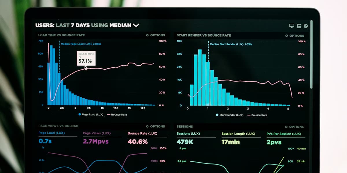
Choose charts that match the question
Match encoding to the task: trends over time → line or area; ranking or comparison across categories → bar; part-to-whole when segments are few and sum to 100% → stacked bar or treemap with care; correlation → scatter. Avoid pie charts when comparing more than a few slices or when precision matters—bars almost always beat pies for comparison.
- Same unit of measure on one axis when comparing series.
- Start bar charts at zero so length encodes value honestly.
- Label directly on or near marks when the audience is non-technical.
- Avoid dual axes unless the relationship is truly essential—they are easy to misread.
Interactivity that earns its keep
Every filter and drill path should save someone a meeting or an ad hoc query. If a control changes only one small chart, ask whether it belongs on a detail page instead. Cross-filtering (selecting a bar highlights related series) rewards exploration without cluttering the default view.
Performance and trust
Slow loads train people to stop opening the dashboard. Slim queries, cache aggregates where appropriate, and align refresh cadence with how often the metric actually changes. Publish when data was last refreshed and who owns definitions. Nothing erodes trust faster than two “official” numbers that disagree.
Governance without bureaucracy
Assign a named owner per dashboard. Version significant changes (even a short changelog in the team wiki). For client-facing boards, agree on sign-off for new metrics before they appear in the default layout. Small habits prevent silent drift.
Shipping dashboards with DataNests
DataNests is built for teams that need live, shareable dashboards without running a custom BI deployment. Connect sources you control, lay out KPIs and charts, set refresh expectations for your plan, and share read-only links with stakeholders. Use the AI assistant to iterate on queries and explanations in plain language—then validate anything that affects revenue, compliance, or contracts.
What to do next
Pick one recurring meeting, list the three questions it always asks, and sketch a dashboard that answers only those. Review with real users once, cut one chart, and ship. Iteration beats a six-week “perfect” design that never launches.
Questions people ask when they start
Straight answers—no sales fluff. If you are comparing tools or onboarding a team, these are the details that usually come up.
What makes a dashboard effective?
An effective dashboard answers a small set of repeated decisions with clear metrics, honest charts, and a layout that matches the audience—executives need brevity; analysts need exploration. Trust comes from agreed definitions and predictable refresh.
How many KPIs should an executive dashboard show?
As a rule of thumb, five to seven primary KPIs on the default view. More metrics belong in drill-downs, secondary tabs, or separate analytical boards so the main screen stays scannable.
Should I use pie charts on a business dashboard?
Pie charts work for a few parts of a whole when precision is not critical. For comparing categories or many segments, bar or stacked bar charts are usually easier to read and compare.
How do I keep dashboard performance fast?
Pre-aggregate where possible, limit rows returned to the visualization, cache expensive queries, and match refresh cadence to how often the underlying metric changes. Show “last updated” timestamps so users interpret staleness correctly.
Who should own a dashboard?
Assign a named product or analytics owner responsible for definitions, access, and change reviews—especially for client-facing boards. Without ownership, metrics drift silently.
How does DataNests help with dashboards?
DataNests connects your sources, lets you build and share live dashboards with controlled refresh, and includes an AI assistant for plain-language help with queries and interpretation—always validate figures that affect money or compliance.
Keep reading
Related posts
More on dashboards, integrations, and how teams ship client-ready analytics with DataNests.

November 15, 2025 · 18 min read
Getting Started with DataNests: A Complete Guide
A practical, in-depth guide to DataNests: who it is for, how to connect real data sources, build your first dashboard, use the AI assistant with example prompts, share with clients, and avoid common mistakes. Includes FAQs for search and AI assistants.
Read article
November 8, 2025 · 13 min read
Effective Strategies for Data Visualization
How to design charts and reports that people understand and act on: clarify the message, pick honest encodings, use color and labels for cognition (and accessibility), avoid common chart lies, and test with real readers—aligned with SEO and answer-engine friendly structure.
Read article
November 5, 2025 · 15 min read
Choosing the Right Data Integration Tools
A practical framework for picking data integration and analytics tooling: inventory sources and latency needs, compare ETL vs ELT vs streaming, evaluate connectors and total cost, run a focused proof of concept, and connect integration choices to how teams consume data in dashboards.
Read article