
Getting Started with DataNests: A Complete Guide
A practical, in-depth guide to DataNests: who it is for, how to connect real data sources, build your first dashboard, use the AI assistant with example prompts, share with clients, and avoid common mistakes. Includes FAQs for search and AI assistants.
On this page
DataNests
Turn data into dashboards your team actually uses
Connect sources, build client-ready reports, and ask questions in plain language with AI assistance.
At a glance
If you have landed here, you are probably tired of duct-taping spreadsheets, screenshots, and five different tools just to answer simple questions like “Are we up on revenue this week?” or “Which campaign actually paid for itself?” DataNests is built for that messy middle ground: teams that need real dashboards and client-ready reports without hiring a full data engineering department overnight.
- Connect databases, cloud tools, and analytics sources you already use.
- Lay out metrics in a dashboard that is easy to read—not a wall of charts.
- Use plain-language questions with the AI assistant when you are stuck on a query or a KPI definition.
- Share live views or snapshots with stakeholders who will never open SQL.
Who this guide is really for
You might be an agency owner sending monthly performance decks to clients, a founder watching funnel and revenue in one place, or an ops lead who finally wants one source of truth for the leadership stand-up. You do not need to be a data scientist. You do need to know what decisions you are trying to support—that is the part we cannot automate for you, and honestly, that is a good thing.
What DataNests is (in plain language)
DataNests is a web-based analytics workspace. You connect sources you authorize, build widgets (charts, tables, KPIs) from that data, arrange them on dashboards, and control how often data refreshes. An AI-powered assistant helps you phrase questions, refine queries, and interpret what you are seeing—especially useful when your team speaks “business” more fluently than “JOIN.”
It is not a replacement for your database, your warehouse, or your CRM. Think of it as the layer where those systems meet the people who need to decide something this week.
Three real ways teams use it
Before you log in: a five-minute checklist
- Pick one decision you want the first dashboard to support (not ten).
- Identify the one or two systems that hold the truth for that decision.
- Confirm you have credentials or OAuth access for those systems—read-only where possible.
- Agree on refresh expectations: hourly might be fine for marketing; finance might need a different rhythm.
- Name one “dashboard owner” on your side so layout and definitions do not drift.
Step 1: Create your account and connect your first source
Start at the app signup flow (linked from the main DataNests site). Once you are in, open Integrations or Connections—wording may vary slightly by version—and choose a source that matches your checklist above.
For a relational database such as PostgreSQL or MySQL, you will typically need host, port, database name, user, and a password or key. Test the connection before you save; if it fails, the error message is usually specific (firewall, SSL, wrong database). For OAuth sources like Google Analytics, you will grant only the scopes the product requests—DataNests is designed to use limited, explicit access rather than broad account takeover.
If the connection fails
- Check IP allowlists: some cloud databases only accept traffic from known IPs.
- Confirm SSL mode matches your provider’s requirement.
- Verify the user can reach the right schema—not just the server.
- Still stuck? Email support@datanests.io with the error text (redact secrets).
Step 2: From connection to your first useful widgets
Once the source is healthy, you are really asking: what slice of data answers your decision? Start with one metric you already track manually—monthly recurring revenue, weekly active users, cost per lead, whatever you trust today. Recreate that metric in DataNests so the number matches your “gut check” source; if it does not match, fix the definition before you add ten more charts.
You can often use a guided query builder or write SQL if you prefer. The AI assistant shines when you describe what you want in English—for example: “Show me total revenue by week for the last 12 weeks, broken down by product category.” Iterate: narrow the date range, exclude test orders, add a filter for a single region. Small iterations beat one giant perfect query on day one.
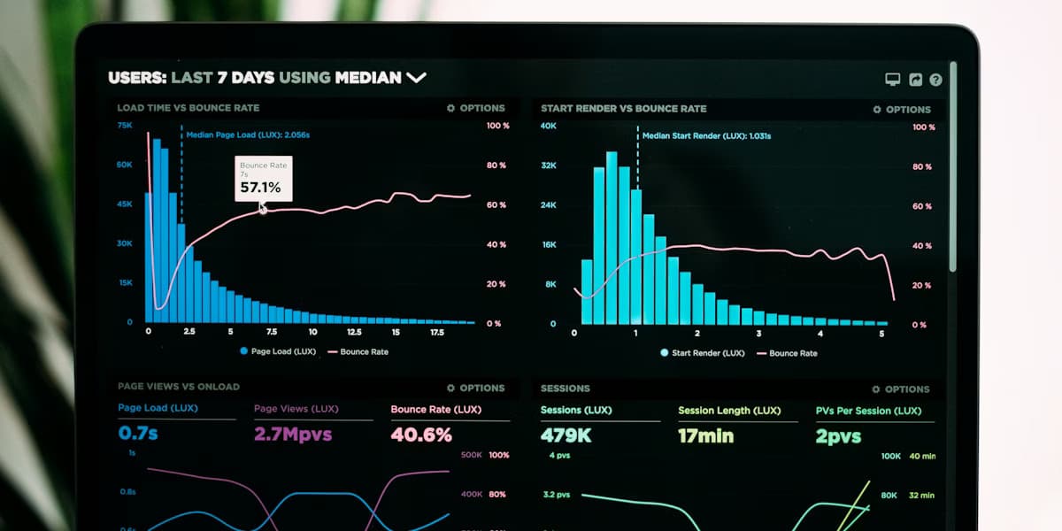
Widget types that work well early
- One big KPI number at the top (the number everyone asks about first).
- A line chart for trend over time.
- A bar chart for comparison across categories.
- A simple table for the top 10 rows driving the metric (campaigns, SKUs, pages).
Step 3: Lay out a dashboard people will actually open
There is a reason airport signs put the gate number big and the trivia small. Put the primary KPI and trend where the eye lands first—usually top-left for left-to-right readers. Group related widgets: acquisition metrics together, revenue together, product usage together. Use consistent labels (“Last 30 days” vs “L30D” — pick one and stick to it).
If you are presenting to executives, bias toward fewer charts and clearer labels. If the audience is analysts, you can add filters and secondary breakdowns. The same data can support both; the layout should not pretend every viewer is the same person.
Step 4: Use the AI assistant like a colleague, not a magic eight ball
The assistant is best when you give it context: what you are trying to decide, what you already tried, and what looked wrong. Good prompts sound like: “Here is our definition of an activated user—first session with feature X. Can you suggest a query that counts activated users per week from this events table?” Weak prompts are vague: “Make my data better.”
- Ask it to explain a spike or drop in one sentence for a client email.
- Ask for alternative chart types when a metric is hard to read.
- Ask it to sanity-check whether a join might double-count rows.
- Ask for a checklist of filters you might have forgotten (geo, bots, refunds).
Always verify numbers that drive money or compliance. AI suggestions are a starting point; your ownership of the definition is what makes the dashboard trustworthy.
Step 5: Share with your team or clients
When you share a dashboard, you are sharing a point of view: these metrics, this refresh cadence, these filters. Agree with stakeholders what “live” means so nobody refreshes the page expecting real-time data if the plan refreshes hourly. For clients, a stable link plus a short written “how to read this” paragraph often beats fifty slides.
Export options (such as Excel-friendly exports or scheduled email snapshots, depending on your plan) are useful when someone needs an offline artifact for legal, finance, or a board pack. Use exports as supplements, not the only copy of truth, or you are back to version chaos.
Common mistakes we see (and how to avoid them)
- Building twenty widgets before validating the first metric—slow down and reconcile one number.
- Mixing “last 7 days” and “last complete week” on the same screen without labeling—your team will argue about ghosts.
- Giving every viewer edit access—use clear ownership and read-only sharing where possible.
- Ignoring refresh limits on the entry plan and expecting minute-by-minute stock data—match plan to reality.
- Skipping documentation: write a one-pager on definitions; future-you will thank you.
Security and privacy (the short, honest version)
DataNests is built so you connect sources you control; dashboards stay private unless you choose to share them. Industry-standard encryption in transit and at rest, limited OAuth scopes where applicable, and a published privacy policy are part of how we think about trust—not a footnote. For Google Analytics specifically, our privacy page describes which scopes we use, how data may be cached, and how you can revoke access from your Google account settings.
If you need vendor details for your security review, start with the Privacy Policy on this site and contact hello@datanests.io for deeper questionnaires.
Pricing and when to talk to sales
Published plans cover a wide range of team sizes: smaller setups with a single dashboard and periodic refresh, growing teams with multiple dashboards and faster refresh, and enterprise-style needs with custom integrations and SLAs. If you are unsure which tier matches your data volume and refresh expectations, the pricing page spells out feature differences in plain language—and you can always email support@datanests.io with your scenario.
What to do next
Create the account, connect one source, build three widgets that answer one decision, and share the link with one stakeholder for feedback. That loop—connect, visualize, validate, share—is the whole habit. Everything else is refinement.
When you are ready for more depth, browse the rest of the DataNests blog for dashboard design, visualization choices, and integration thinking—or reach out if you want a human to sanity-check your plan before you invest a week in layout.
Questions people ask when they start
Straight answers—no sales fluff. If you are comparing tools or onboarding a team, these are the details that usually come up.
What is DataNests used for?
DataNests is used to connect business data sources, build dashboards and KPI views, and share them with teams or clients. It is aimed at people who need clear analytics without maintaining a custom BI stack by hand.
Do I need to know SQL to use DataNests?
No. SQL helps for advanced modeling, but many workflows use guided builders and the AI assistant. Teams often start without SQL and add it later for edge cases.
Which data sources can I connect?
Common options include relational databases (such as PostgreSQL and MySQL), cloud data services, spreadsheets and APIs, and analytics products like Google Analytics—depending on current integrations in the product. Check the in-app integration list for the latest connectors.
How does the AI assistant help?
You can describe goals in plain language, get help structuring queries, explore why a metric moved, and iterate on chart choices. It is an assistant for speed and clarity—you should still validate anything that affects money, compliance, or contracts.
How often does my data refresh?
Refresh frequency depends on your plan and how you configure widgets or sources. Entry plans often use hourly or scheduled refresh; higher tiers can support faster updates. Match your plan to how stale a number can be before it misleads a decision.
Can I share dashboards with clients?
Yes. You can share views with stakeholders who need read-only access to agreed metrics, which is a common agency and consultancy workflow. Define your metrics clearly so clients interpret charts the same way you do.
Is my data secure?
Connections use encrypted transport; data is handled according to our Privacy Policy and security practices. You control which sources are connected and what gets shared. For enterprise reviews, contact the team with your questionnaire.
Where do I sign up?
Use the signup flow at https://app.datanests.io/signup from the main marketing site. You can also review pricing at https://datanests.io/pricing before choosing a plan.
Who should I contact for help?
Email support@datanests.io for product help and hello@datanests.io for partnerships or larger deployments. The contact page on datanests.io lists the same addresses.
Keep reading
Related posts
More on dashboards, integrations, and how teams ship client-ready analytics with DataNests.
November 12, 2025 · 14 min read
How to Build Effective Data Dashboards
Practical dashboard design for teams and clients: define decisions first, match layouts to executives vs analysts, pick charts that tell the truth, handle filters and performance, and ship dashboards people reopen—plus how tools like DataNests fit in.
Read article
November 8, 2025 · 13 min read
Effective Strategies for Data Visualization
How to design charts and reports that people understand and act on: clarify the message, pick honest encodings, use color and labels for cognition (and accessibility), avoid common chart lies, and test with real readers—aligned with SEO and answer-engine friendly structure.
Read article
November 5, 2025 · 15 min read
Choosing the Right Data Integration Tools
A practical framework for picking data integration and analytics tooling: inventory sources and latency needs, compare ETL vs ELT vs streaming, evaluate connectors and total cost, run a focused proof of concept, and connect integration choices to how teams consume data in dashboards.
Read article